The Challenge
While computational tools like R (ggplot2) and Python (matplotlib, seaborn) are essential for statistical analysis, their default export engines frequently introduce visual errors: overlapping axis labels, clipped legends, awkward color palettes, and unwanted clipping masks. When submitted to high-impact journals, poorly formatted figures can distract peer reviewers and diminish the perceived quality of the underlying research.
The Strategy
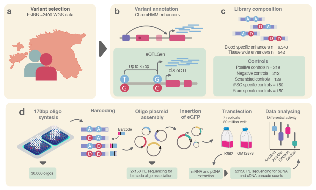
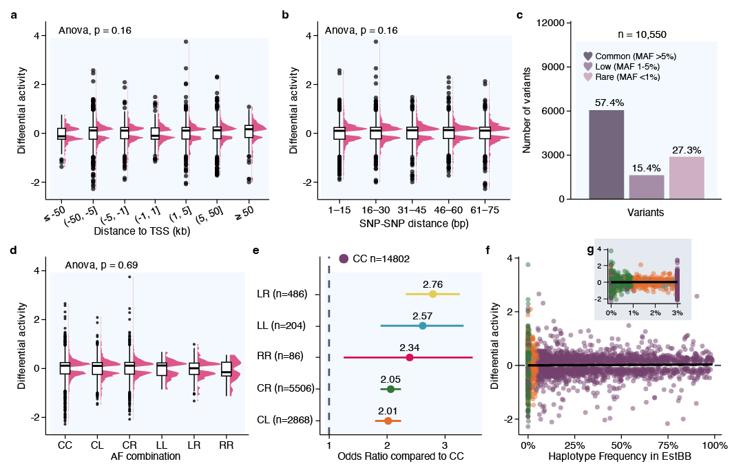
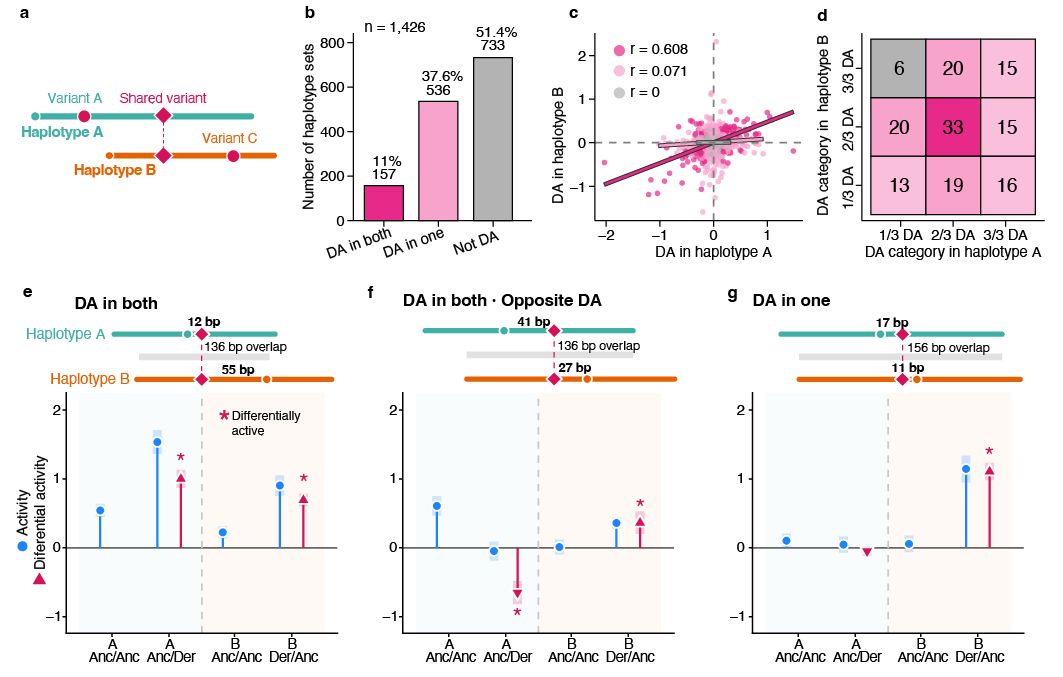
Yolia took the raw vector exports and applied a meticulous scientific graphic design overhaul:
- Vector Dissection & Cleanup: Removed redundant software-generated masks, unlinked overlapping text strings, and aligned subpanels (A, B, C, D) onto a rigorous editorial grid.
- Typography & Contrast Calibration: Standardized all fonts, font weights, and point sizes across all multi-panel figures to comply with strict international journal submission guidelines.
- The "Making Of" Video Breakdown: Documented the step-by-step transformation from raw script output to publication-grade visual asset, highlighting the necessity of human design precision in empirical communication.
"Making Of" Vector Overhaul Breakdowns
Step-by-step vector reconstruction showing raw script exports transformed into publication-grade figures.
The Visual Outcome
- Transformed complex multi-panel statistical plots into publication-ready figures accepted without formatting revisions.
- Provided the researchers with both print-ready CMYK assets and high-resolution digital RGB vectors for global dissemination.
Curated Production Assets
Click any photo to open the interactive carousel gallery